Don’t tell them; show them!
Numbers don’t lie. That’s true. But they can be really boring. When you have a lot of numbers, try to help the viewer relate to them. Infographics are very “in” these days but what are they? Simply put, they are a combination of information and graphics. Effective communication is the key when dealing with a lot of information. Although, an appealing design is crucial to attract readers, it is not everything. Here are our 12 tips for launching a new website infographic:
GetOvergram.com mentions that Facebook has 10,000 times more photos than the United States’ Library of Congress! That puts things into perspective and there is a context that the reader can relate to.
Your infographic should flow from the beginning to the end. It should be told like a story which has an introduction, a middle and an end. You can use the heading to give a clear introduction about what is going to follow. The information can then follow in chronological order or you can even prioritise according to what you think your reader would want to read first.
For example, in the above infographic by infolinks.com about the history of advertising, they follow a clear structure of historic events and pick the most momentous ones that changed the course of history forever. Each event has an accompanying illustration which makes you curious enough to read the text beside it.
At the end of the day, an infographic is also a design. It should be structured in a way that it controls the eye movement of the reader and helps the reader reach the end of the graphic. You can create hierarchy by using principles of basic design such as contrast, balance and perspective or you can go old school and use arrows.
In the above example about social media personalities by mylife.com, the eye is guided through the infographic using simple arrows that aren’t too meddlesome with the design but work well with the light illustrations and text. Remove the arrows and you would lose sense of where to go first and which text to read last.
Infographics are all about making a lot of text understandable through appealing graphics. This does not mean that any wonderfully illustrated image will go well with your text. The pictures in an infographic should add meaning to the whole package. A simple test is to remove the text and see what story your visuals are telling. If it is a story that doesn’t comply with your text, or if it makes no sense, it’s time to go back to the design board.
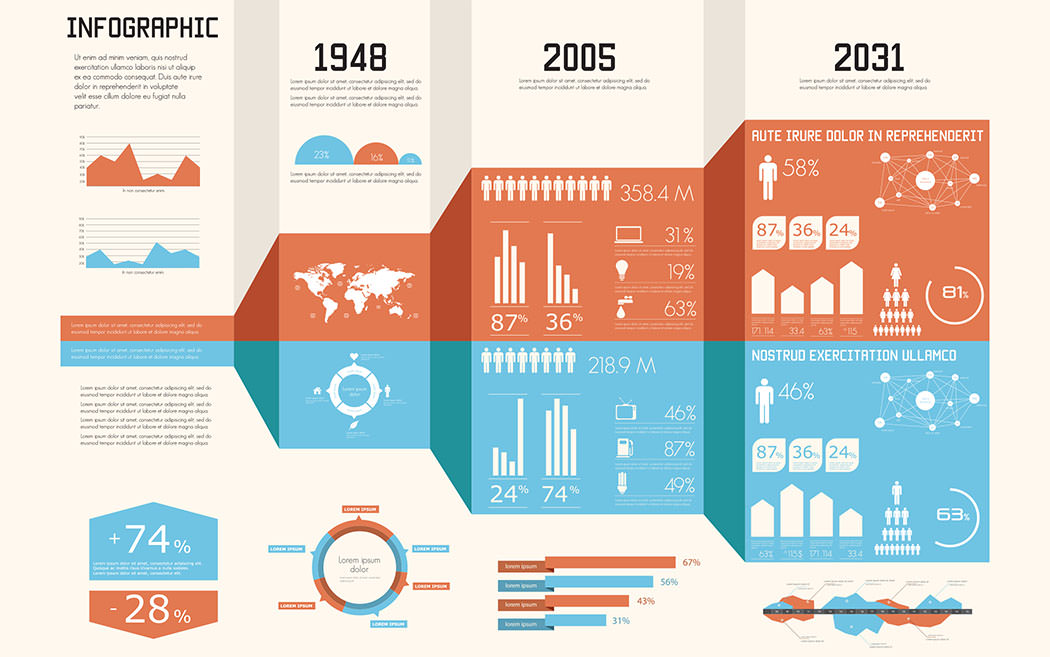
In the infographic developed by Cygnis Media about the usage of Facebook and the penetration of Facebook in our lives, the visuals are well aligned with the stats. Even if you remove the text, the pictures will say the same thing.
When creating an infographic, choose a topic that your target audience wants to know more about. More often than not, trending topics are the most popular. People want to get statistics about events going on around them so that they can know more about it and spread the word.
For example, at the end of 2012, Mashable released a tremendous infographic marking the most popular memes and social events of the year. That is a recipe for attracting eyeballs.
Consider an infographic a one-stop-shop for information geeks. Once they get into your infographic, they should be able to extract all the information that the headline promises to give them. Gather enough data and figures about your topic so you can fulfill your readers needs.
For example, soci@ljumpstart created an infographic about social media usage around the world. Now, that’s a pretty vast topic, but they did a splendid job of explaining it all with catchy graphics and comprehensive data. True, the design and typography could use more improvement, but the topic coverage is great.
Even though you have to cover the topic at hand, you don’t want to overload the reader. Once you’ve collected the data, sift through it and find out which statistics fit best with your storyline. Only pick relevant information and cover the major points of focus in your topic. You can always add a little figure here and there if you feel the need.
For example, Apollo Group wanted to create an infographic underlining the importance of reading and to motivate parents to cultivate reading habits in their children. The infographic is the best example of being straightforward and comprehensive.
When you’re creating an infographic that passes some sort of judgement or is drawing a conclusive decision, quoting examples is a great way to support your point. Of course, this means doing a little more research, but the more you know, the more it will show!
SmartBear came up with an infographic titled “The Cost of Poor Web Design” in which they discussed how ignoring web design can cost you valuable money. They gave the example of Obama’s and Romney’s websites.
Since infographics are a fun way to convey a lot of heavy numbers and help readers easily digest them, it doesn’t hurt to add a little bit of humour to make it more interesting. Everyone on the web is either there for information or for entertainment. Infographics can be infotainment and deliver everything in one package.
For example, Killer Infographics created one that defined the cliche “make it pop” for different industries. Not only is the topic dripping with sarcasm but it picks up pace as you read on.
Infographics contain a lot of words which means that they are heavily dependent on great typography. Choose your typefaces carefully and add variation in fonts to keep it interesting.
The above is a great example of a well-typed infographic by Killer Infographics.
You didn’t see this one coming, did you? But Wolfram Alpha is a search engine that relies completely on well-presented information. Yes, you read that right. If you’re an infographic addict, Wolfram Alpha is your Hawaii. Type your queries and Wolfram Alpha will instantly give you statistics, maps, locations and other details in just a few seconds!
In conclusion, infographics can be a fun way of conveying a lot of information and big numbers to your readers in a way they can comprehend. Infographics are trending because people no longer have the time to go through boring statistics. Attractive, relatable visuals, practical typography, contextual analysis and comprehensive research are just some of the things why people love infographics. When you set down to make your next one, keep this checklist of 12 tips in mind!
Looking for app development services,
advices & best practices?
Contact us
Call us: +1 (925) 292-6668
Email us: [email protected]
We are a team of product designers, engineers and data scientists with a diverse skillset and vast experience across several industries.


Pleasanton, CA 94588, USA
© 2010-2024 Cygnis Media. All rights reserved.
Sitemap Privacy Policy