“In the last 15 years, our attention span has decreased from 12 seconds to 8 seconds, which is even shorter than the attention span of a goldfish at 9 seconds.” – Forbes
But why has it decreased so much, in such little time? The answer lies in the technological advancements of the last 15 years that have rewired our brains. Today, we have more options and choices available in just about anything. Researchers even predict that our attention spans will decrease even further in the coming years.
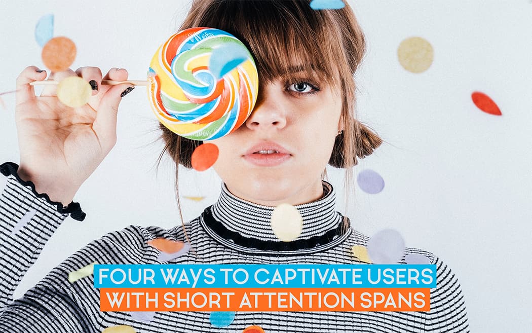
The big questions:
Right now, amid the technology advancement and concentration span turmoil, the ultimate question for designers and developers, based on the user experience psychology is: “how to retain users’ attention on their products for longer periods?”
But there is also a catch. The attention span isn’t actually decreasing across the board based on some metrics. For example:
Game of Thrones series is the most watched tv series of all time, and one episode of this series is around one hour long. It will take 60+ hours to watch all seven seasons (Source).
Game of Thrones Tv Show
So, the basic question is, how come people are still watching this tv series?
The answer lies in its interesting content, engaging story, cleverly made scenes, and immersive visuals.
And the big question: “How can you make your product engaging in the same way?”
We have provided a few tips that can help you design captivating user experiences to keep the users tuned to your products.
Most of us love to travel. We are always looking for new places to provide us with unique experiences because visiting the same places again is dull and boring. Similarly, design that is repetitive and doesn’t have any novelty is dull and boring too. That’s one reason most of us don’t pay attention to the four ads that show on top of our Google searches.
While making products, try to make them a little different than what is already available in the market. A great example in front of us is Buzzfeed. The website garners millions of page views per day because of its unique ‘listicle’ style. The images, and the content of the website are unique, and that’s what people love about it.
What a typical article on Buzzfeed looks like
Google now focuses on websites that load with blazing fast speed. This is because when the user doesn’t see a website loading for a long period, they will close it and move on. A better way to retain their attention is to show them a progress bar so that they know how much longer they will have to wait to begin browsing the site.
According to a survey, 75 percent people want an indication of some sort when a web page is loading- Kissmetrics
Take advantage of background loading
Instagram is one of the many apps that employ background loading technique to load content transparently in the background and serve them to the user seamlessly when required. This way, when the user begins browsing their Instagram feed, they can view the content instantly as it has already been pre-loaded, and as they are browsing the content that is already available thanks to the pre-load, the next set of content is pre-loaded in the background, and the cycle continues.
This improves customer retention and app’s performance.
Another reason that keeps users engaged to Instagram is its super-quick picture upload feature. The app sends two requests instead of one to do this. When a user uploads a picture to their Instagram account, while they are selecting the filter, the picture is automatically getting uploaded to the server. And, when the user finally hits the upload button, it appears on their photo feed instantly. It’s attention to details like this that have garnered Instagram an immense following of loyal users and massive user retention rates.
Our team of user-experience designers can turn a project brief into a visual prototype, collaborating with you every step of the way.
The biggest reason people bounce from a website is because the information on it is not what they were looking for. Recently, Google has made changes to its algorithm to delist websites that did not have information relevant to queries they were associated with. And, to rank well on search, developers and content creators need to focus on showing valuable information first.
Inverted Pyramid
A good way to show valuable information is by using the inverted pyramid style of writing. The style is used widely in news channels and papers to show relevant information first. The strategy focuses on 5Ws and 1H. Marketers, developers, and content creators can use the same strategy to sell their products, and inform users.
Use long-form content
Whether you are developing an app, a website, or any other product, it will need content. Content can either be text, audio, or even video. One good way to retain users on your product is by publishing long-form content filled with visuals and videos so that users spend some time on the website. Our brains are wired in a way, that when we see a website with a lot of information perfectly formulated, we consider it as a trusted source. As a designer, use this to your benefit.
Engage users with audio and visual content
Websites now use a mix of audio and visual content because it decreases bounce rate. When a video is embedded on a website, even if the text-based information is not interesting for the user, there is a higher chance that he will watch the video. Most product-based websites now focus on case-studies and infographics to retain users because articles with images are 94% more likely to be read by them. Source
A big advantage for most designers is the structure of a website. The structure includes the assembling of information, design of the website, use of colors, contrasts and opposites.
If it is a web portal, focus on adding the most important parts on top. For example, adding important services, login options and pages that you want the user to view should be placed prominently on the front-page of the website.
Layout optimization
Layout matters the most when it comes to retaining users. But how do we optimize layout and what techniques are used for monitoring user attention? Let’s find out.
While designing the layout of text-rich websites or apps, three common patterns are followed. These are:
F pattern
The pattern starts from top-left and then follows an F pattern ending at the bottom-left.
Z pattern
The second pattern assumes that a user’s eyes move in a ‘Z’ pattern while skimming the text of a website. The Z-pattern is also called as the ‘Inverted S’ with edges.
Gutenberg diagram
The Gutenberg diagram hints at a distinct pattern that user’s eyes follow while skimming the content on a screen. It has distributed the screen into four quadrants.
We’ll collaborate with you to build a user experience that addresses the specific needs of your product and its end-user.
It tells that the eyes follow an angle from top-left to bottom-right area of the screen ignoring the weak areas.
Therefore, placing important content like logos or a headline on top and a call-to-action at the bottom-right will be a good idea.
Even if your product is great, most users will simply not use it because of the distractions ingrained in it. Take the example of websites. Thanks to the invention of popups, now almost each website out there has some kind of distraction either in the shape of a subscription popup, odd color schemes, intrusive ads, or contains irrelevant content on top of the page.
Use interactive elements with bigger size
Prominent, well-placed CTAs can increase conversion on the webpage. According to the Fitts law, the closer and bigger an object is, the faster it is to click.
The law is basically a mathematical function and is studied in human interaction design (HCI) class but for now, understanding it in pure english will also do the work.
Mathematical Representation of Fitts law
This simply means that the CTA buttons, or the information that you would like the users to see should be:
Limit User Options
Spreading too much information on the screen can have adverse effects on website visitors. Our brain can focus on only one thing at a time. By adding too much on a single page, the users simply don’t comprehend it. A UX design solution to this problem is to limit the information to be displayed.
That is…
Though it is true that we have an eight-second attention span for things that disinterest us, the good news is that clever design tactics can improve it.
This means that by getting rid of the distractions, and showing important content with a proper call to actions, with properly placed buttons, and by adding novelty to the content and design, we can hold our audience’s’ attention for a respectable amount of time.
Want to read more about designs? Check out the difference between Microsoft Fluent Design and Google Material Design
Looking for app development services,
advices & best practices?
Contact us
Call us: +1 (925) 292-6668
Email us: [email protected]
We are a team of product designers, engineers and data scientists with a diverse skillset and vast experience across several industries.


Pleasanton, CA 94588, USA
© 2010-2024 Cygnis Media. All rights reserved.
Sitemap Privacy Policy