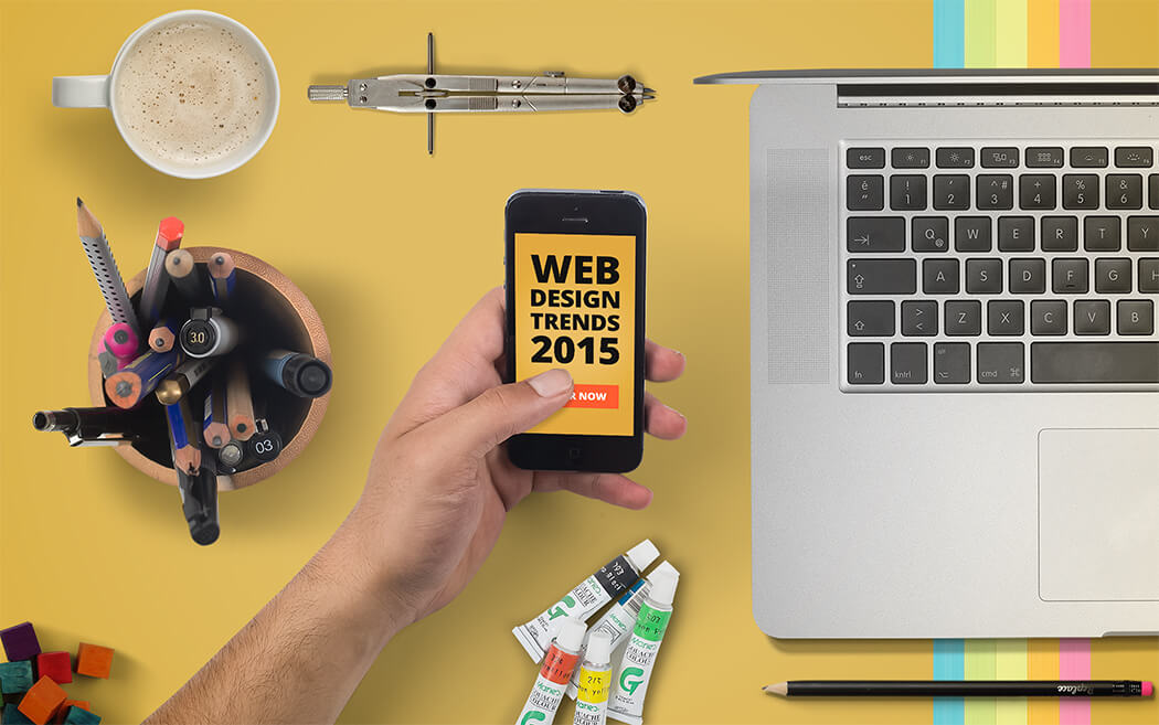
The year 2014 has given us some spectacular web design trends. As the year 2014 is about to end, we are bound to discuss new year’s web design trends as per our tradition. This post is all about the new year’s design trends. Let’s dig in straight away.
Google has introduced material design, which looks interesting and engaging upon first glance. The concept tries to create a visual language based on people’s interaction with the web and mobile devices. The material design approach incorporates a unified experience across devices and platforms by declaring touch, voice, mouse and keyboard as first class input methods. According to the concept, the design approach is inspired by the study of paper and ink, yet it is open to innovation, imagination and technological advancements.
The design approach inspires designers to create materials with new innovative affordances (user’s understanding of an object’s movement and working: For example, a twisting knob) while using familiar tactile (sense of touch) attributes. The concept describes a lot of things for designers, including but not limited to, material environments (3D space), material properties, Object in 3D, and Animation. We can see these principles being incorporated in Google’s web services (Google Docs and Inbox) and Android Lollipop.
Last year we discussed how designers will follow a content first approach. Well, this year the content first approach will be accompanied with flexible typography. In the year 2015, the old adage of “keep your text small” may finally go away.
When we discuss flexible typography, there are three main features that affect the readability on the web:
It has been explained through research, that larger text sizes are easier to read on the web. Designer communities have already implemented responsive typography along with responsive images and structures. It is important for the text to be at its best (readability and looks) regardless of platforms.
Every designer loves to include an element which is minimal, attractive and has some animation. Ghost buttons reflect all these attributes, thus making them popular in the designer communities. These add extra value and attraction to call to action areas.
Circular progress buttons display great affordances to users. For example, a submit button can act as a progress bar. It gives immediate feedback as well as saves on space.
One of the most impressive trends which took great leaps in the last year is parallax scrolling animation. We have seen it on product pages for Apple and Google products, and the results speak for themselves. The sites with parallax scrolling can increase engagement by as much as 70%.
People these days are more used to scrolling than clicking, thanks to Facebook and Twitter news feeds. Apart from looking good, the techniques require less page loading. Moreover, it makes it easy to create seamless transitions from point to point with no troublesome refreshes. Scrolling keeps the information flowing.
In the year 2015 we may see a lot of designers incorporate parallax effects with scrolling animations into their designs.
Every time we change settings, sync our data or device, pick a password, log in, set a status message, favorite or like something, we are engaging with a micro interaction. Developers will incorporate micro interactions for tasks like email sign ups and ratings, which normally require a separate page. This simplifies users’ interactions with the design and increases engagement. The year 2015 may see a lot of micro interactions, as we have already seen a lot of themes and plugins addressing this design element.
Large images have stormed the world wide web as the problem of limited bandwidth reduces with the passage of time.
The year 2015 may see large images take control of the web design in new interesting ways. Innovative design and development techniques will surface for responsive resizing, extracting dominant colors for backgrounds, and optimizing images for minimum server load. Another major trend will be the use of images as background. The blur and color filter overlays will allow text to be on top without compromising usability.
If an image is worth a thousand words, a video may be worth a million. However, the advanced style of doing this is to add a video to your home page’s background. A simple tag line and a video in the background is a wonderful design concept to win visitors’ attention. Moreover, it is a great way to reflect the objective and distinct style of your web site.
Web design trends are more like guidelines, the success mantra lies in a designer’s innovative approach to those trends. It is the responsibility of designers to transform ideas into trends and trends into industry standards. The design trends, discussed here, are quickly becoming conventional in web design and will find an even greater recognition in the coming year.
Looking for app development services,
advices & best practices?
Contact us
Call us: +1 (925) 292-6668
Email us: [email protected]
We are a team of product designers, engineers and data scientists with a diverse skillset and vast experience across several industries.


Pleasanton, CA 94588, USA
© 2010-2024 Cygnis Media. All rights reserved.
Sitemap Privacy Policy