After teasing rumours about flat design and improved functionalities for months, the new Apple iOS7 has finally been revealed. At the WWDC 2013, Tim Cook emphasised that the iOS powers 600 million devices across the globe and has been ranked at the top in customer satisfaction by JD Power nine times in a row. This means that Apple can’t bring drastic changes to the operating software as that could confuse a huge audience.
However, Apple’s senior vice president of software engineering, Craig Federighi added that even then, “iOS 7 is the most significant iOS update since the original iPhone.” We have divided this post on the iOS7 into three parts – the features, the user experience and the visual design.
Our analysis? Features & user experience = slick. Visual design = WHAT?
Let’s start with the good news…
Apart from a few innovative ideas of its own, Apple has borrowed features from Android OS and Windows OS, added the flavour of cool we have come to adore and packaged them together into iOS7. There are some features which have been added long after they should have been, but oh well… at least they’re here now.
We’re delighted to see that our most used settings are now huddled together in the control center. From adjusting brightness, switching to aircraft mode, playing songs to operating the flashlight and Wi-Fi, we can now access all these one-tap buttons in the new Control Center. The Control Center can be pulled up any time by swiping bottom to top, even while we’re running an app.
Other OS providers merged the search and surf functions into the URL box long ago but Apple has only just caught up. Borrowing from Windows, Apple iOS7 lets you preview browser tabs as vertically scrolling rectangular cards. There is no longer a limit to the number of browser tabs you can open.
Other OS providers merged the search and surf functions into the URL box long ago but Apple has only just caught up. Borrowing from Windows, Apple iOS7 lets you preview browser tabs as vertically scrolling rectangular cards. There is no longer a limit to the number of browser tabs you can open.
Sharing files with iOS users around us was fun with AirDrop. The new feature allows file transfer across nearby Apple devices. The functionality will be rolled out soon for iPhone 5, iPad (fourth generation) and iPad mini.
Everytime you click a photo with iOS7’s camera app, it saves the geolocation and time of the capture. The photos are then organised as Moments, a feature of iOS7 that arranges your photos chronologically. You can zoom out and watch all photos year to year. You can also share them with family and friends on iCloud and add comments.
iTunes Radio is another new feature of iOS7 but it had us wondering: do we really need it? With all the stuff already available on iTunes, who needs a separate app for managing radio channels? But then, maybe some people do. Do you think this is a great new feature?
The iOS7 finally updates all our apps automatically, thank goodness! If you’d like to see the new version of an app before you update it, you can turn automatic updates off from the Settings panel.
Siri has been updated to include two more voice options (a male and a female). The application opens in full screen and a waveform animation indicates that Siri is listening to you. Siri has become more powerful and can now take voice commands such as playing your voicemail or searching Wikipedia or Twitter. However, Siri takes some time to answer back and Google still holds the crown for fastest voice searches.
The iOS7 detects which apps you use the most frequently and dedicates more power to them. This means that it allows for efficient battery consumption. It also lets you see a tall preview of all open applications (Windows strikes again) and swiping away a preview closes the application.
The weather app now shows dynamic animations according to the weather. So, a thunderstorm in your city means the weather app will show bolts of lightning flashing across your iPhone. Reminded us of the enchanted ceiling at Hogwarts… but we digress. Pinching the screen will show you an all city overview.
If you’ve had a bad (read horrifying) experience of having your iPhone stolen, you have reason to rejoice. The iOS7 comes equipped with an activation lock which can only be unlocked using your iCloud ID and password. Your iPhone remains safely yours and if you find it, you can always reactivate it.
Overall, the iOS7 promises great user experience. With translucency, parallax and animation taking center stage, the iPhone smoothly transitions from one screen to the next. Here are some of our favourite interactions:
We can agree that even though the iOS7 doesn’t come packed with a bucketload of new features, it is understandable that the platform needs to be familiar for Apple’s millions of users. However, what we don’t understand is what Jony Ive has done with flat design. Here’s the not-so-good news:
There were several witty remarks at the WWDC from Apple itself on their previous skeuomorphic (don’t make us spell that again, please) designs. Sure, the flat design was a great approach to go for but did they make it work?
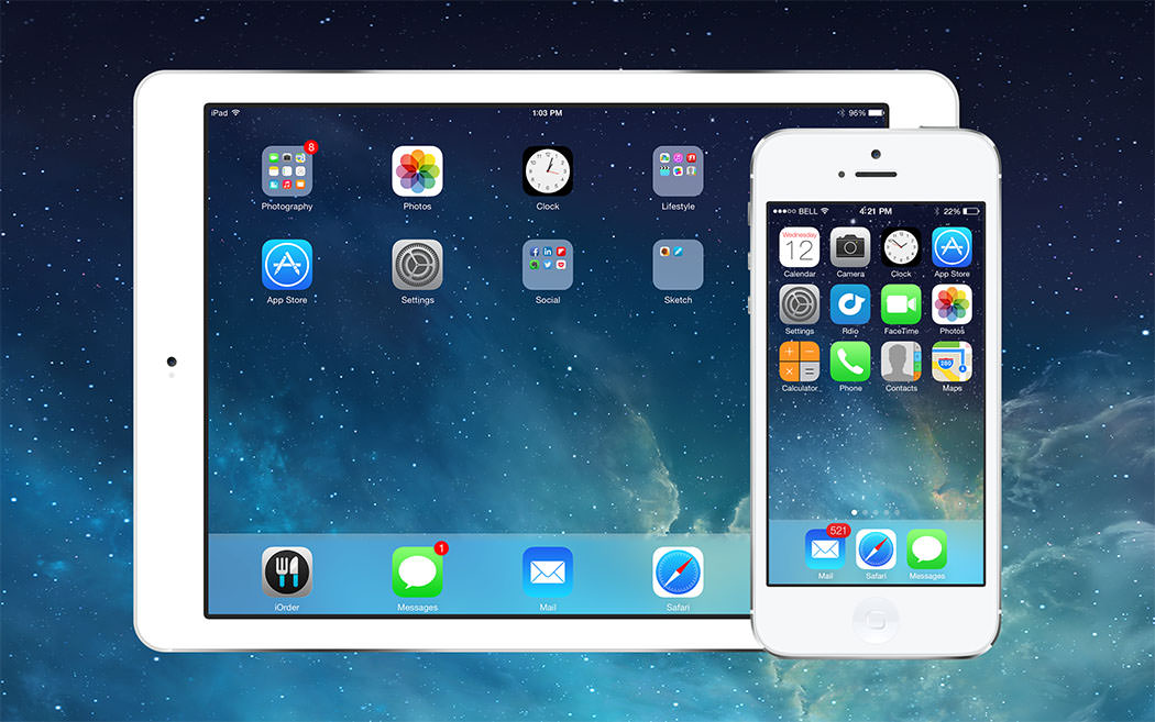
Take a look at the new iOS7’s home screen. Where do we even begin? The icons are so weird, we couldn’t believe our eyes. They are… childish. It is great to see simplified symbols for app icons but the gradients they are sitting on are horrendous. We hated looking at it. There is very little contrast, no concept of hierarchy between foreground and background and the lack of harmony in colours makes the design look like someone dropped a set of crayons.
The icon for Settings doesn’t look like a gear. At first glance, we thought it was a fan or a stove. The Safari buttons have no spatial consistency: one is left-biased, another right, then top, then bottom. The middle button is also confusing: it doesn’t symbolise sharing.
And then, whatever happened to consistency? There is no underlying theme to the overall design of iOS7. It looks like a lot of designers created individual designs and brought them all together in one software.
We love the black and white designs within some of the apps and the spacious Mail application with ample negative space. They are stunning! The look is elegant and sleek, just what you’d want in an innovative Apple product. But if they had designed something beautiful, why didn’t they carry it throughout?
The font the new iOS7 relies on looks a lot like Helvetica Neue and it gels in really well with the full screen applications, giving the iPhone screen a longer look. Though we’re slightly concerned about legibility – the new font would work wonderfully on desktop devices but when it comes to handheld iPhones out in the bright sunlight, would it be readable?
The iOS7 holds great promise for the future. The integration of brand new features and revamping of the old shows why Apple is so dearly loved. Even though Apple borrowed from Windows and Android, it has proven that when it comes to innovation, a horde of updates aren’t necessary to make a great product. A little tweaks here and there can mean a lot to the smartphone user. It is all about convenience and efficiency.
As far as the visual design is concerned, we’d like to see more consistency and better appeal. The icons need to definitely change while the home screen and control center need to look more like they’re a part of the same iOS.
It is probably too early to comment on the few setbacks because the new iPhone will be revealed in Fall. We’re waiting till then with our fingers crossed, sincerely hoping that Jony Ive puts some sense into the visual design. Till then, stay tuned to our blog for iOS7 updates.
Looking for app development services,
advices & best practices?
Contact us
Call us: +1 (925) 292-6668
Email us: [email protected]
We are a team of product designers, engineers and data scientists with a diverse skillset and vast experience across several industries.


Pleasanton, CA 94588, USA
© 2010-2024 Cygnis Media. All rights reserved.
Sitemap Privacy Policy