In the realm of complex business software, solid information architecture is the backbone of success. Think of it like an intricate and colorful tapestry — every thread serves a purpose, weaving together the bigger picture that captivates the user. Visualizing your information architecture is paramount for designing the most effective and user-friendly applications, ultimately shaping the UI/UX design into a strategic masterpiece.
In this article, we’ll delve into why visualizing your information architecture is essential in designing applications for complex businesses. We’ll touch on how to enhance your UI/UX design, and illustrate the benefits of incorporating visual elements in your strategy. Buckle up, it’s going to be a mind-opening journey!
Why Visualize Information Architecture?

First, let’s clarify what “Information Architecture” encompasses. Like a blueprint for a building, information architecture is the structure of the software, organizing content and functionality in a way that makes sense to the end-user. It’s the “why” that answers how data, features, and menus are interlinked and prioritized. But why do we need to visualize this framework? Let’s find out:
Enhancing User Experience
Compelling UI/UX design is crucial to apps and software systems in today’s digitally driven business world. Visualizing information architecture directly impacts UI/UX design by anticipating user needs, forecasting pain points, and offering a streamlined interface. Some key benefits include:
- Simplified navigation, allowing users to focus on the task at hand.
- Seamless integration between different sections and features.
- Enhanced consistency and predictability for the user throughout the application.
- A polished user experience providing a sense of comfort and trust in the software.
Accuracy and Precision
When designing applications for complex businesses, every small error or misjudgment can lead to dire consequences. Visualizing your information architecture allows you to:
- Identify potential bottlenecks, redundancies, and misconnections.
- Sharpen the accuracy and relevancy of your data structures.
- Ensure proper alignment of resources and functionalities.
- Save time and effort by addressing these issues during the development phase, rather than during the testing or launch stages.
Bringing Stakeholders on Board
Creating a visual representation of your information architecture not only aids in designing applications but also serves as a powerful communication tool between stakeholders. It’s the perfect bridge between the technical jargon of developers and the business expectations of decision-makers. Some perks include:
- A comprehensive overview of the software’s structure for stakeholders, improving collaboration.
- Facilitating discussions around features and functionalities, enabling early-stage feedback.
- Clearer understanding of the product vision, fostering a united team working towards a common goal.
Now that we’ve established the reasons for visualizing information architecture, let’s discuss how we can incorporate it into designing applications.
Visualization Techniques for Information Architecture
There’s no one-size-fits-all solution for visualizing information architecture. Depending on your software’s complexity, target users, and organizational goals, you may choose one or a combination of these techniques:
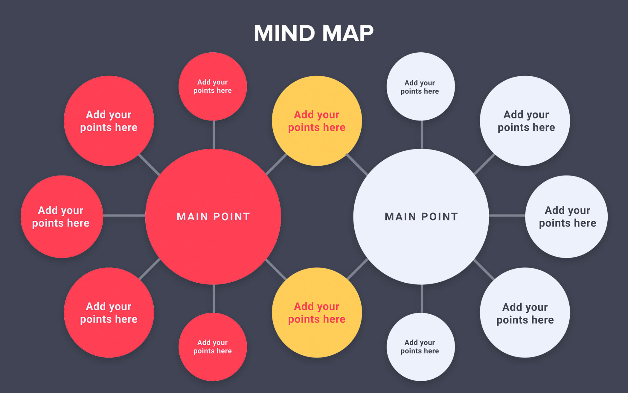
Mind Mapping

Mind mapping is a useful technique for visualizing your information architecture. By creating a visual representation of your ideas, you can help to organize your thoughts and identify patterns and connections. Mind maps can also help to facilitate collaboration between designers and developers by providing a shared understanding of the project.
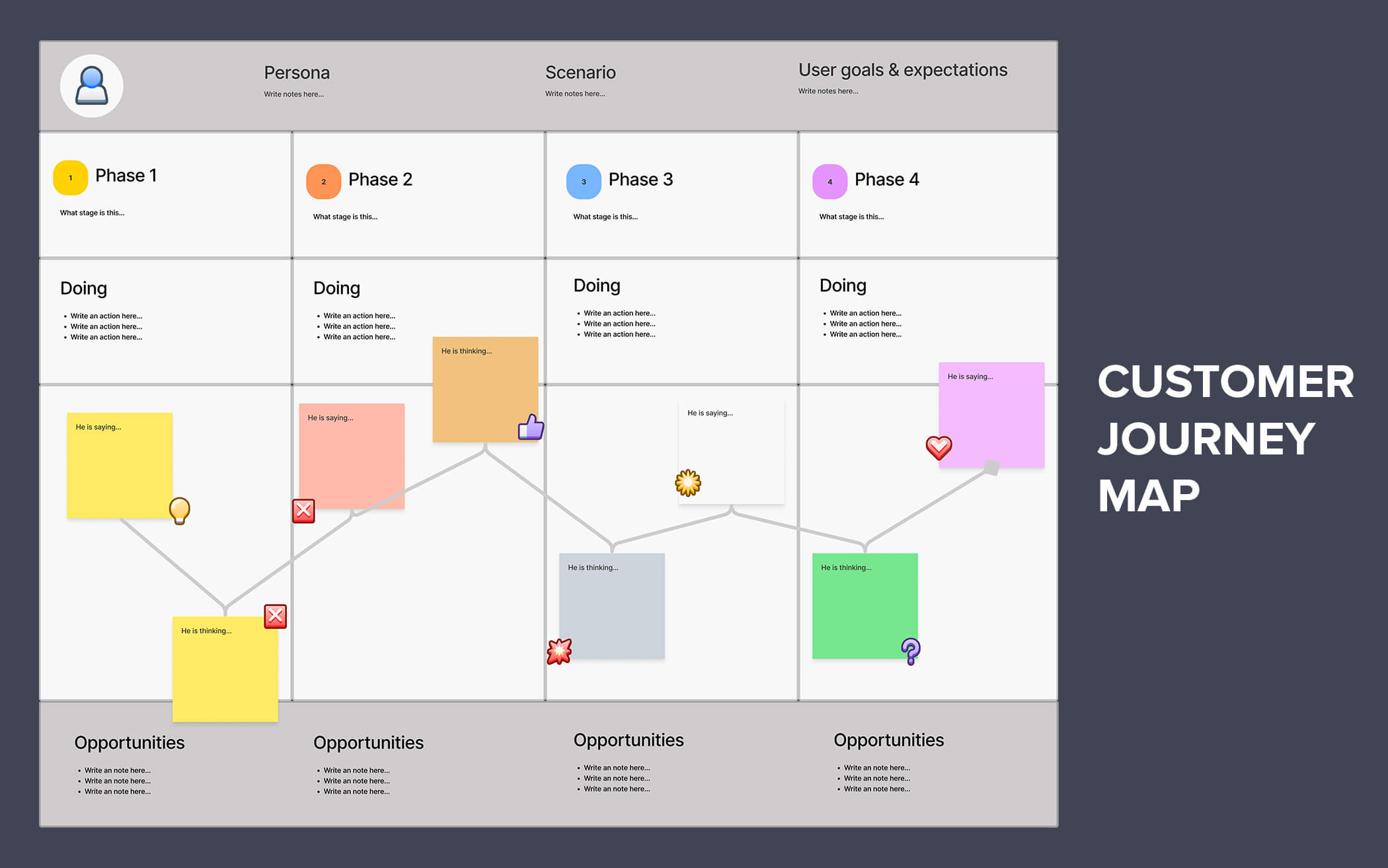
Customer Journey Mapping

This technique focuses on mapping the path that customers take throughout their interaction with your software or application, including all touchpoints and potential roadblocks. By visualizing the journey, you can uncover areas of improvement and optimize the experience, identifying gaps in the user’s journey and addressing the pain points they may face.
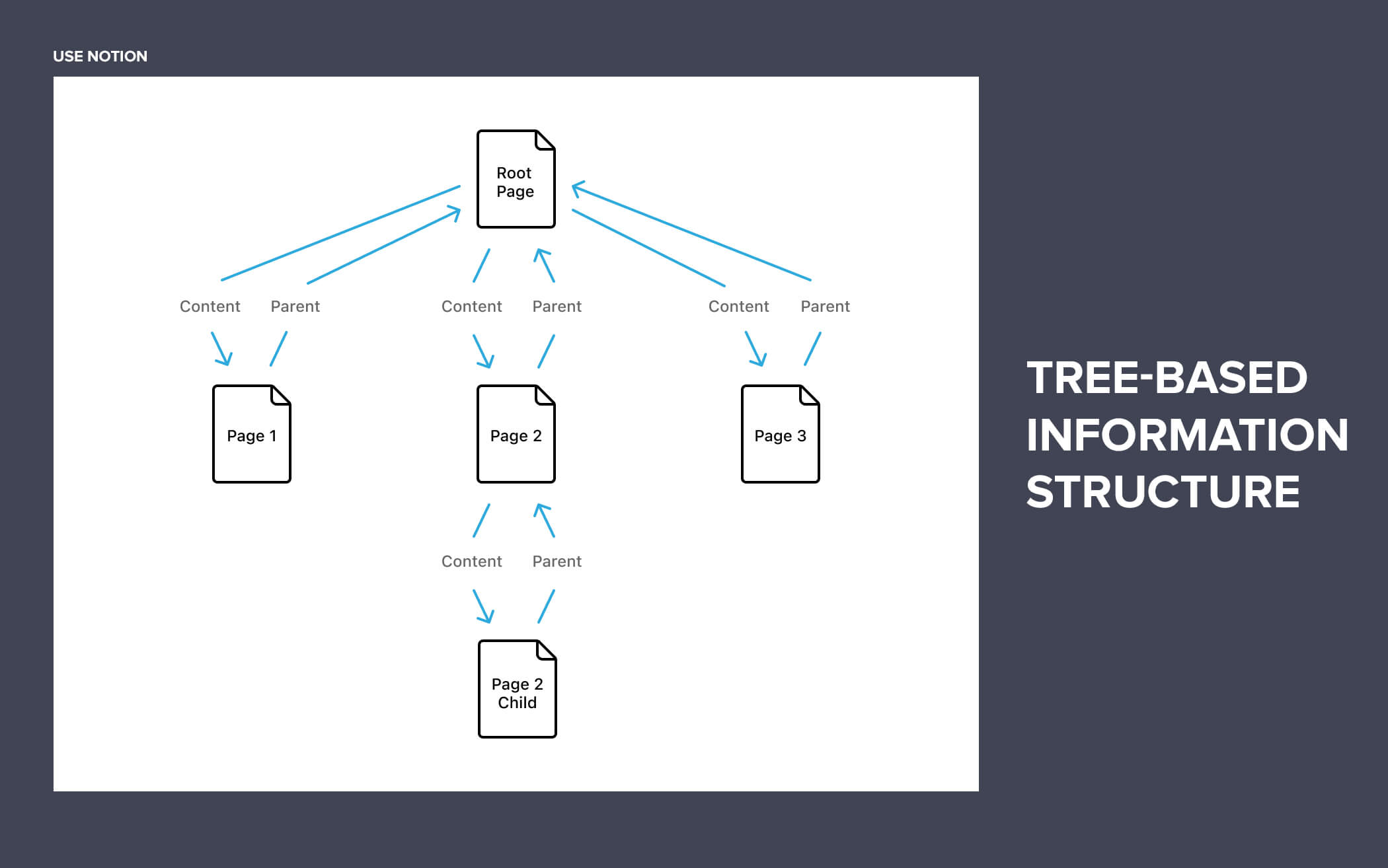
Tree-Based Information Structure

A tree-based structure is a hierarchical model that illustrates parent-child relationships within the software, much like branches of a tree. Each “branch” represents a category or main function of the software, while the subsequent “leaves” depict subcategories or related functionalities. This visualization technique provides a clear, top-down view of your software, ensuring that your information remains organized, accessible, and easy to navigate for users.
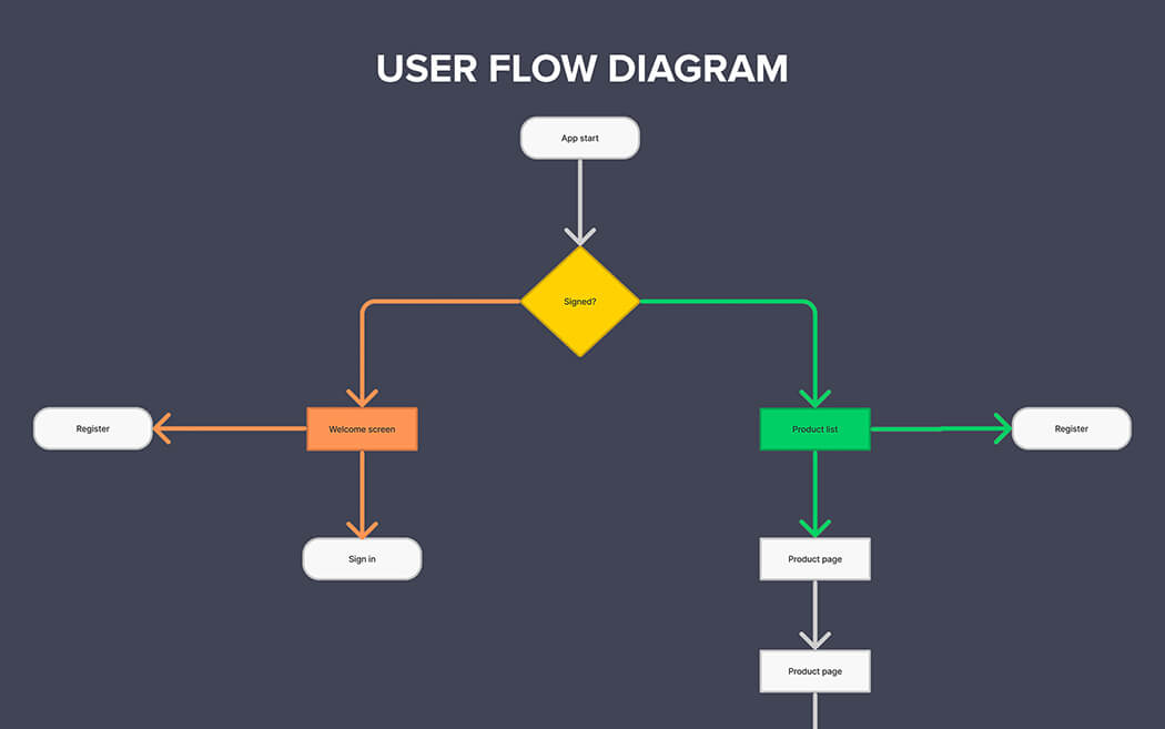
User Flow Diagrams

User Flow Diagrams provide a step-by-step visualization of the user’s interaction within the application or software, which helps to map out how they navigate from one screen or module to another. By outlining the sequence of actions, this technique helps to: – Uncover any potential pain points, bottlenecks, or dead-ends users might encounter – Ensure smooth transitions between sections, guiding users intuitively through the software – Identify opportunities for improvements, such as better onboarding processes, personalized content, or context-aware help prompts.
Sitemaps

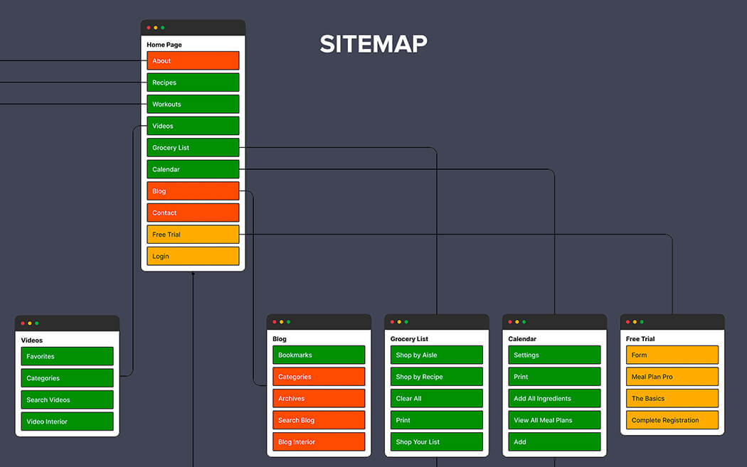
Sitemapping is another useful technique for visualizing your information architecture. By creating a visual representation of your site’s hierarchy, you can help users to navigate your site more easily and find the information they need quickly. Sitemaps can also help to ensure that all stakeholders are on the same page by providing a clear understanding of the site’s structure.
Wireframes

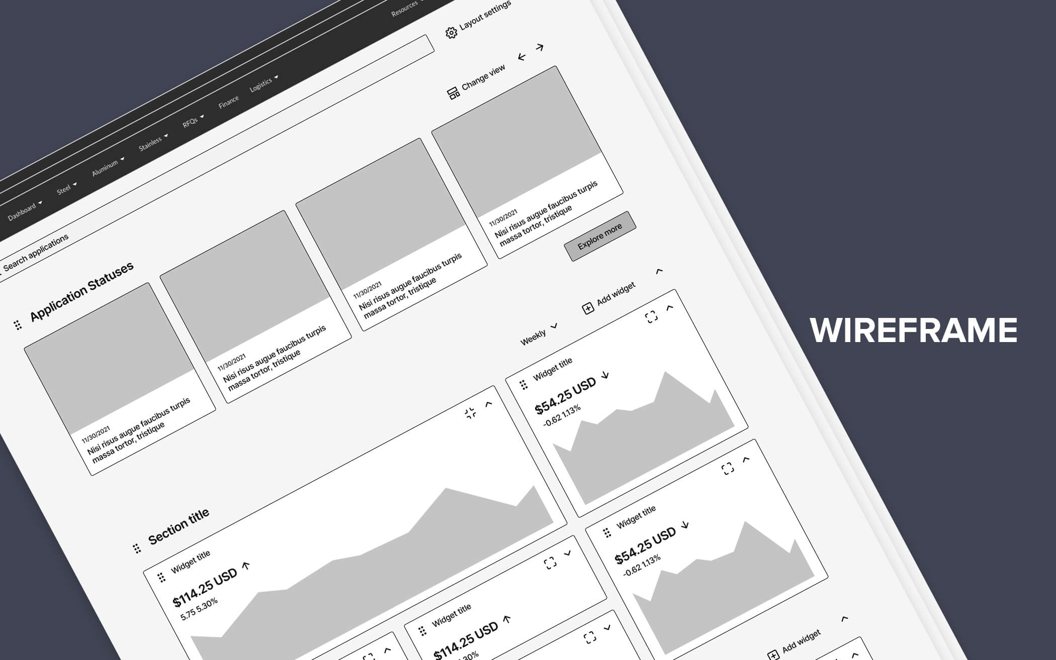
Simple sketches of individual screens, focusing on content placement and the overall user interface, and allows stakeholders to review before full UI/UX design takes place.
Wireframes are basic, visual representations of individual screens or pages within the software, focusing on the arrangement of elements, text, and overall interface layout. This approach is valuable in:
- Establishing visual hierarchy and balance, enhancing legibility and readability, ensuring a streamlined user experience.
- Allowing for iterative design, eliciting early feedback from stakeholders and test users, leading to a more effective and well-informed UI/UX design.
- Quickly testing and validating ideas, as it’s faster to make changes on wireframe sketches than on full-fledged designs.
Now onto the FAQs to address some common questions while embracing visualization in your information architecture.
FAQs
How do I begin visualizing my information architecture?
Start by identifying the needs and expectations of your target audience. Clearly outline the scope of your software, brainstorm its features and functionalities, and create a hierarchy or flow that meets those needs. Finally, select an appropriate visualization technique and begin placing your elements with both aesthetics and user experience in mind.
How often should I update my information architecture visualization?
Like any good plan, your information architecture design should be dynamic and adapt to change. Frequent reviews and updates are essential to keep pace with evolving user behavior, shifting business landscapes, and emerging technologies.
How do I ensure the effectiveness of my information architecture visualization and UI/UX design?
First, focus on simplicity and clarity—adopt a minimalist approach to design that makes information easily digestible. Secondly, seek feedback from both peers and end-users, iterating and refining based on their experience. Finally, stay informed on the latest design trends and best practices, ensuring your software remains both visually appealing and user-friendly.
Conclusion
The art of visualizing your information architecture is the golden ticket to designing effective, impactful, and user-friendly applications for complex business software. By employing a clear-cut plan and analytics-driven approach, you can maximize your UI/UX design, streamline the development process, and create a tailored masterpiece that your users will love.
Remember, There’s beauty in simplicity, and by incorporating visualization techniques, you can reveal the hidden gem within your software’s architecture—providing an immersive experience that leaves users enchanted and engaged.
Need to build an enterprise grade software?
We replace old enterprise implementations with the latest technology, custom built for better scale, security, usability and value.
 Web Applications
Build web apps using cutting-edge technology
 Business Intelligence Apps
Empower your business with fast & actionable BI Apps
 Mobile Applications
Build cross-platform apps for iOS and Android devices
 Internet of Things Apps
Streamline your operations with cloud-based IoT apps
 AI Products
Unlock the power of AI & ML with our expertise
 Minimum Viable Product (MVP)
Mitigate risks & accelerate your project development
 Enterprise Software
Build custom enterprise solutions for your business
 Software as a Service (SaaS)
Scale your business with ease and cost-efficiency


