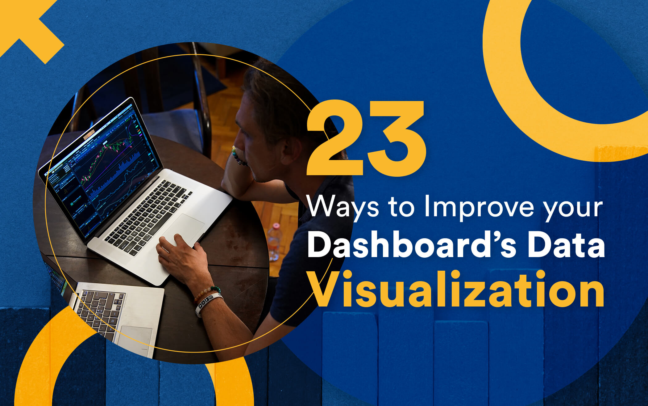
Dashboards are magical.
They are cute little Pandora boxes that provide you with the best of business insights at the ease of your finger tips.
Human affinity for data and trying to make sense of it is undeniable.
Be it the Egyptians circa 300 BC trying to capture all ‘data’ available in the library of Alexandria or Ptolemy circa 200 AD making a database of Greek constellations in his Almagest, one pattern is prevalent.
The data humans interact with tends to be in visual forms.
The difference is staggeringly simple: We have eyes to process large amounts of visual imagery but we do not have analytical engines in our brains to process large amounts of numeric data. And amusingly enough, this is exactly why there is an entire field of computing known as computer vision only to imitate the way human eyes process data.
Data Visualizations act as a campfire around which we gather to tell stories.
The world is still adapting to the data revolution. We are still trying to make sense of the profundity of data available to us. The following graph puts the exponentiality of human data production into perspective:
Total data volume worldwide 2010-2024

So the real question is: What do we do with all this data?
The answer is simple: We analyze it.
But how do we analyze it? Visually.
The goal is to turn data into information, and information into insight.
The true utility of big data is that it helps make BETTER decisions!
It does not matter whether you are a C-class employee of a Fortune 500 firm or a middle school teacher running your day-to-day errands. Data based predictions ultimately find their way into your life. From Google Maps predicting the best traffic route to Power BI predicting your quarterly sales volume, data-oriented decisions are increasingly becoming an inseparable part of our lives.

In such a setting, it becomes paramount for businesses and organizations to keep up with data technologies to make the most informed decisions.
This “keeping up” fundamentally drills down to making data more and more human readable. This is where dashboards come in. They visualize data for us.
Dashboards are like expensive cars! You have to constantly maintain them for them to stay relevant – for them to remain useful.
Data-visualization technologies are constantly evolving, with data scientists continuously experimenting. Today’s dashboard scene is not as it used to be twenty years ago, nor is it the way it will be twenty years in the future.
Following are today’s most popular methods of visualizing data listed along-with their pros:


 Chart Data Visualization Example")


We replace old enterprise implementations with the latest technology, custom built for better scale, security, usability and value.


With cross platform compatibility, web apps remain the ultimate medium for a product. Tell us about your project for a free consult.


But these are only twenty-two? What’s the twenty-third?
The twenty-third and the most important of all is that the world doesn’t end here! You may equally design any mishmash of the above visualization methods for your dashboard, customfit to your own needs.
Sky’s the limit!
The art and practice of visualizing data is becoming ever more important in bridging the human-computer gap to mediate analytical insight in a meaningful way.
Looking for app development services,
advices & best practices?
Contact us
Call us: +1 (925) 292-6668
Email us: [email protected]
We are a team of product designers, engineers and data scientists with a diverse skillset and vast experience across several industries.


Pleasanton, CA 94588, USA
© 2010-2024 Cygnis Media. All rights reserved.
Sitemap Privacy Policy