Back in 1996, Nokia’s 9000 Communicator created ripples in Finland as the first web-friendly handset in the market. From then on, there was no looking back. As web accessing mobile device after device became available to the consumers, it became important to deliver web content on the go. This gave rise to our present-day hullabaloo about “responsive design”. Sure, you’ve heard the name before and read countless blog posts on how responsive design is simplifying the way consumers interact with online information.
But in this blog post, we’ll not only highlight the needs of responsive design but also what hurdles you may have to face as a business developing responsive websites. We’ll also discuss how responsive design is not the only thing that brands need to do to make their information smarter for the consumer.
So we’ll get right down to it. What is the need? Here are a few statistics to get started with:
According to a survey by Monetate, around $38.8 billion will be spent on shopping through mobile this year in 2013. Of the total Internet visits, Americans access 28% more often from their smartphones than their desktops. Moreover, where e-commerce website traffic is concerned, 21% of visitors are now accessing web pages from their smartphone.
In the US, 91% people agree that they are within reaching distance of a mobile device 24/7 and of course, when they have to make a buying decision or choose the next venue for a birthday party, 67% are more likely to buy from a mobile-friendly site.
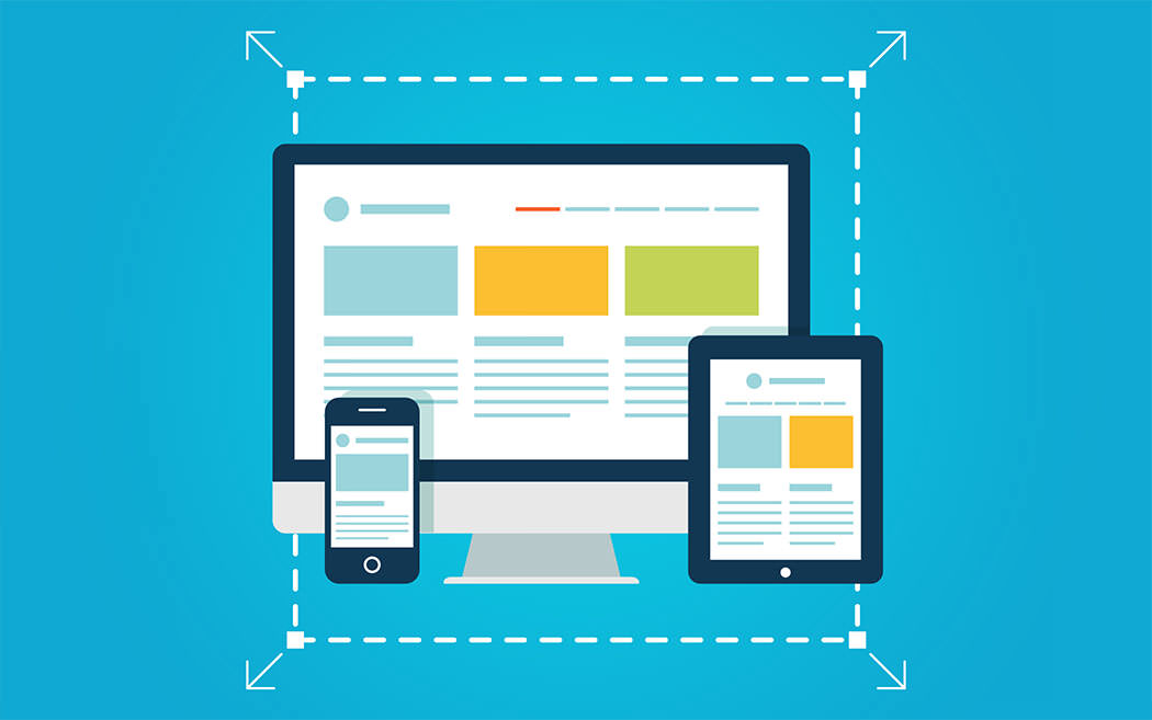
Not a problem yet, right? You can always make a mobile-friendly site and reach those millions of users. Starting today. But wait, there are more than 232 sizes of screens available in different devices. Now what? That’s where responsive design comes in.
Instead of creating 232 different layouts for your website to be loaded on separate devices (and who knows how many more as technology advances), you create one layout that fits itself automatically on the screen it is displayed. Since this layout is ‘responding’ to the screen size, these website designs are called “responsive designs”.
Your mind is probably whirring with excitement right now. Think of the possibilities!
That all sounds cool. For an ideal responsive design, the results will be just that but to achieve a responsive layout, you’ll have to sweat a little over these hurdles too:
You need to be able to intelligently monitor traffic and see where your visitors are coming from when visiting from a mobile device. You should be able to determine what location they access it from the most and what locations are nearby. This will help you generate personalised content and understand your visitor better. For example, if someone always accesses your website from a cafe, you know they’re visiting your site while, say, sipping coffee. This information can be extremely useful if utilised well.
You can also access the current and forecast weather around that individual and curate your content accordingly. Then of course, the demographics (urban/rural, middle/upper class etc.) and past visits of the customers should also be considered.
Remember that your customers are not all statistics. They’re not numbers driving on the road, walking the dog or buying pizza. They’re real people in the real world. You should be able to detect how two customers are different from each other. For example, funnel data can show you the percentage of returning visitors but you also need to know how one returning customer spent more in the last month while another spent only a few dollars.
It would be cruel, and ignorant, to treat both of them the same way.
All of this information is useless if you can’t immediately take action about it. Make sure that the content on your website is in real-time so it reaches the customer accurately when he needs it. Next, you also need to consider which elements of your website (apart from design) need to be more responsive than others.
We’ve covered only a little ground about responsive web designs. If you’re curious to learn more, see the responsive design handout from Monetate, read this case study of cyberduck.com and how and why they developed a responsive website for themselves, or Campaign Monitor’s guide on how to create responsive email design.
From Nokia’s 9000 Communicator to .mobi sites to the iPhone and the explosion of mobile devices, we’ve come a long way in making information available on the go. But what people need to catch up to is how that information can be useful and easy for the reader. Responsive design allows you to create one website for all devices and while it has its initial cons, it can pay off in the long run if your customers are constantly in need to accessing your website on the go. Specially considering the 2013 statistics, no one can be in doubt that more and more consumers are making the switch to mobile devices. Now it’s your turn: will you make the switch?
Looking for app development services,
advices & best practices?
Contact us
Call us: +1 (925) 292-6668
Email us: [email protected]
We are a team of product designers, engineers and data scientists with a diverse skillset and vast experience across several industries.


Pleasanton, CA 94588, USA
© 2010-2024 Cygnis Media. All rights reserved.
Sitemap Privacy Policy