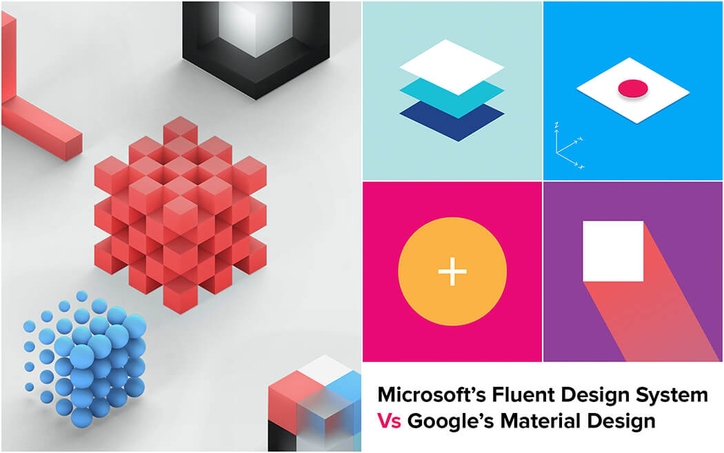
At the Build conference in Seattle, Microsoft introduced a new design language that is being claimed to be on par with Google’s Material design – the Fluent Design System.
A design system represents a set of guidelines that help designers create interactive elements to achieve the most engaging experiences on particular platforms. Just like how Material Design provides the guidelines for desktop, tablets and mobile devices.
Over the past few years, virtual reality and augmented reality have created a huge buzz in the tech industry by providing an environment similar to the real world. As technology is moving forward, these realities are merging into one – a mixed reality for a future with no touch interfaces.
Microsoft has been talking about mixed reality since a while, given their investment and interest in the Hololens. And the Fluent Design system is helping them achieve their vision by designing even better experiences for virtual environments.
So much of design’s past is about consumption. This is a move toward creation, letting people solve and imagine in new environments. – Rodney Edwards, Partner Director of Design, Microsoft
This means developing solutions that give us experiences that are closer to life in all platforms.
The Fluent Design System builds on Microsoft Design Language 2 (MDL2) which currently powers Windows 10. According to Joe Belfior from Microsoft, it will help user experience (UX) “break free” of static shapes and into a visual experience that focuses on animation, dynamic layers and rich textures to give users a sense of place and direction within the OS.
We’ll collaborate with you to build a user experience that addresses the specific needs of your product and its end-user.
To understand what Fluent Design has in store, let’s examine the fundamentals or “building blocks” that define it. There are five:
1 – Light:
In Fluent Design, light is used as a basis of illumination, especially in virtual environments or mixed realities where your gaze controls an illuminated pointer.
2 – Depth:
Adds a sense of space within an app by adding 3D (z-axis) information to create elements (like parallax effects) that would fit in mixed and virtual environments.
3 – Motion:
Animations that connect or add a sense of motion as users navigate through an interface. The focus is to make the experience more continuous and fluid in mixed realities as users move through tasks.
4 – Material:
In Fluent Design philosophy, Material can control how user interfaces “bend, stretch, bounce, shatter and glad” during interactions. It also represents the physical properties of objects on physical and virtual UIs (like a frosted or acrylic look).
5 – Scale:
How different UI elements reshape or adapt to different environments. It will be interesting to see how effectively they exhibit this quality when mixed reality becomes the norm.
So how does Fluent Design compare to Material Design, and what does it have in store for the design community? Let’s find out.
Let’s illustrate how Microsoft’s Fluent Design System and Google’s Material Design compare:
Each design system has a different way to gain a user’s attention. For example, Material Design uses floating buttons and long shadow effects to make a button stand out as a tappable area.
But what about a mixed reality in a future where interactive elements are hovering on mid air or in a virtual environment?
To illustrate how Fluent Design might introduce UI elements that can achieve the same goal in mixed realities, let’s compare it with how Material Design currently achieves this:
Material Design uses color: Google’s design guidelines uses bold colors juxtaposed with deep and long shadows to differentiate UI elements. Depending on the purpose, color can be used:
Fluent Design’s light based visuals for click and touch: For user interfaces to be interactive in mixed realities, Microsoft’s Fluent Design system goes beyond color palettes. To illustrate, consider how it uses light to:

Reach out to us with your project brief and we’ll get back to you with suggestions, cost and time estimates.
The Fluent Design system isn’t just about appearances, but functionality as well. Take depth perception as an example. Unlike Google’s Material Design, which is limited to on-screen user interfaces, Fluent Design approaches depth by considering future interactions in which inputs may be beyond just mouse and keyboard.

Material Design:
Google’s Material Design uses cards and collection of cards to display content. Information that needs more focus can be positioned closer to the user, while supporting assets may appear from behind through various effects. To illustrate consider a photo app icon that also displays what is inside the folder so that users don’t have to click on it to see what lies within.
Fluent Design:
Fluent design system uses layers. With Fluent Design, Microsoft is currently testing an immersive 3D depth effect (z-depth layering) or layered user interface coupled with a parallax effect. The addition of the z-axis as seen in this layering effect makes functionalities possible in both 2D flat screens, 3D and immersive environments. It also makes design elements work across different devices and inputs from Windows 10 (gaze, pen, gestures etc).
Back in 2011, iOS was focusing on creating UI that imitates the physical world. The calendar app would have a spiral bind, and a notepad would look like a piece of paper. But as designers progressed, the need to create simple and clean interfaces was integral. This led to the shift from Skeuomorphism to Flat.
Critics of flat design argue that it had gone too far. Hence with Material Design, Google bought back some skeuomorphism to flat by adding the z-axis to cause elevations and shadows. The goal was to make designs further appealing and intuitive.
With Fluent Design, Microsoft has moved a step further and is trying to achieve what no other platform has to this date – it is creating tools and guidelines for a new facet in development, where people will probably use interfaces without physical input methods such as a mouse, keyboard, or a pen. With Fluent Design, Microsoft is creating a design system that works with your voice or gaze to interact with applications. Let’s look at some principles that would help designers transform their UI in the coming future.
Motion:

The Fluent Design system shows us how animations become a part of the UI as you navigate. The blend helps in creating consistency when you transition between different pages or tasks. Consider how the Windows voice recorder app uses animations to signal the strength of sound signals it receives while recording.
Material:
During the first wave, Microsoft plans to roll out the Acrylic Material, Reveal Highlight, Perspective Parallax, and connected animations. With the Acrylic Material, you can establish hierarchies and create semi-transparent, textured elements. When it comes to stretching, bending, bouncing, or shattering of an element, it’s Material which dictates these properties.
Scale:

Scale is one of the fundamental building blocks of Fluent Design. It refers to how elements go beyond two-dimensionality to adapt to different screen sizes. Scale really exists in the immersive world of HoloLens. With Fluent Design, Microsoft is aiming to create a design system that is independent of the device.
Microsoft’s Fluent Design System is just starting out, but it holds a lot of promise for app designers. For example, it shall:
As Fluent Design, similar to Material Design, will be a living design document, we hope to continuously see updates that will transform how users interact with software products.
Did you find Microsoft’s Fluent Design System interesting? To learn about ways to improve the user experience, learn how anticipatory design can help you create a great UX.
Our team of user-experience designers can turn a project brief into a visual prototype, collaborating with you every step of the way.
Looking for app development services,
advices & best practices?
Contact us
Call us: +1 (925) 292-6668
Email us: [email protected]
We are a team of product designers, engineers and data scientists with a diverse skillset and vast experience across several industries.


Pleasanton, CA 94588, USA
© 2010-2024 Cygnis Media. All rights reserved.
Sitemap Privacy Policy